Improved magazine cover.
Improved magazine article.
Improved poster.
Improved viral advertisement (email).
T-shirt design.
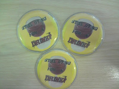
Badge design.
Physical evidence of T-shirt design.
Physical evidence of badge design.
Above are the revised versions of my Unit 5 products, including photos of the T-shirt and badge designs physically printed onto a T-shirt and placed into badge cases. The corrections made were in accordance to the specific aspects of each product my focus group, as well as my client, felt could be improved or changed in order to make them more effective, professional-looking and appealing to the target audience.
I feel I have fulfilled the majority of suggestions made by both the focus group and my client, such as the incorporation of a blue banner conjoined with the NHS logo spread across the width of the page for both the poster and email outlet in order to make the white text stand out more and make the overall products look more professional and visually interesting, the incorporation of more visual elements in my magazine article such as the extra image and the harsh, bold coloured text on the right side of the page (where the focus group claimed something of the likes should be incorporated into it as it had merely been an empty, white space before the improvements were made) indicating where the reader can seek and receive help (I ensured that the College Nurse Team was evident in this information to confirm to students where they can seek help with any health-related query they may have), the deletion of the large, red quotation marks apparent in my original magazine article (in which I merely replaced them with quotation marks more suited to the rest of the article font), and the application of a red stroke line on the magazine cover title "Smashed" in order to make it stand out more.
However, I didn't incorporate specific suggestions for improvement such as the magazine cover puffs for my magazine cover, as I felt the page looked too crowded when I incorporated puffs into it, and also felt at the last minute whilst making the corrections that the amount of information and magazine content featured on the cover may be too overwhelming, daunting or tedious for the reader to have to observe whilst passing by, as well as the application of a design or pattern to the white canvas behind the magazine article title "My Drunken Rage", as likewise, I felt the incorporation of a design crowded the title, created a distraction from the title's initial emphasis, and looked tacky, including the fact that I didn't allow myself enough time to find a subtle yet effective design or Photoshop brushes that looked professional or effective enough to incorporate behind the title. But overall, I feel I've fulfilled a lot of the more vital suggestions for improvement which is evident between my original products and my revised products, and ultimately produced more effective, professional-looking products as a result of acquiring useful audience feedback as well as professional advice from my client.


No comments:
Post a Comment