According to my scheduling document, the work I was required to complete this week was to continue working on my magazine article on InDesign and start creating the design for the T-shirts and badges on Photoshop beginning Wednesday the 23rd February. However, as discussed in previous blogs, I'm slightly behind on schedule as I was not able to book my photoshoot until Thursday the 17th February.
During last Thursday's third period and lunch break, I carried out each photoshoot required for my campaign elements, and am currently cropping around the images in preparation for the creation of the campaign outlets, as well as completing essay work and practice exam questions for other subjects. Each shoot went smoothly and only took up to fifteen minutes each to carry out. I took several shots during each shoot to ensure that I have enough to sift through in order to determine which photos are the best quality to incorporate into my campaign. As a result of adjusting specific settings on the camera, as well as the focus dial and different zoom distances, in order to create the effect I wanted for each photoshoot, I became more confident in using the camera as each photoshoot took place and was reminded of how to use the camera to its fullest extent to create the most effective imagery possible.
However, I can't actually begin creating the campaign outlets until later on in the week as I am awaiting an email from Adobe to come through confirming my Photoshop registration so I can use Photoshop at home. Here are some of the photos taken during my photoshoot on Thursday.
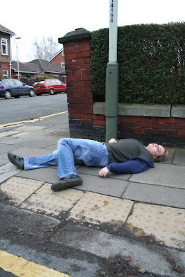

The photos for the poster outlet of the campaign were taken from a mid to long shot to allow the audience to know exactly what's going on in the advertisement and to 'open' the picture up for them, which I feel will hit them harder as they're getting a full insight into the possibilities of excessive drinking, i.e. a drunken hit and run can happen anywhere at anytime, even in a familiar place such as college (hence why the shoot was carried out on the road outside the college; to create a sense of familiarity and enable the audience to relate to the location), especially if alcohol abuse is involved. The fact that the model is the victim in the situation, as well as the fact he's young (which implies he's a student in the college) is even more hard-hitting than if he were the one who'd been drinking excessively and landed himself in trouble as it indicates anyone can be a victim of drunk driving, even students of the college.
Likewise, I applied dark mark-up to the model's face to make it look bruised and as if he'd suffered a trauma of some kind; in this case a hit and run incident. The fact that his eyes are open places emphasis on the imagery's shock-factor and the advert's concept. The slogan "Still dying for a drink" will be present to enable the audience to understand what the advert is about, as well as almost asking the audience "are you still dying for a drink after seeing this?". A sentence referring to the number of drunken "hit and run" statistics will be positioned in the bottom left hand corner to place more emphasis and 'shock-factor' on the advert.
I feel the first shot is effective as it's not too dark nor too bright, therefore it'll be easier on the eye. Regarding the alignment and positioning of the imagery, the distance the shot was taken at has fortunately resulted in the model being centred directly in the middle of the page, which allows enough space for the NHS contact details and drink driving statistic information I intend to incorporate into the advert. Due to these factors, I plan on using this particular image for the poster outlet.
I feel the second shot however, is too bright, purely because of the angle and distance it was taken at in conjunction with the sunlight. There are also bags in the background of the imagery, which looks unprofessional. A rule of thirds isn't present in the image either, whereas in the first shot the imagery can be evenly split up into thirds, which could cause some problems in terms of the positioning of the text I plan on incorporating into the advert. Therefore that particular image wouldn't be an effective one to use for the final product.
Although I don't plan on making drastic changes to the poster outlet as I want it to mirror my treatment document as accurately as possible, I didn't originally plan on incorporating statistic information into the advert as I felt any amount of text would put the audience off. However, I now feel that including a sentence or two of hard-hitting statistic information would be effective as it will inform the audience of the shocking statistics surrounding issues related to binge drinking, but at the same time it won't take anything away rrom the slogan or imagery as it'll be very brief and straight to the point to emphasise its hard-hitting feel.
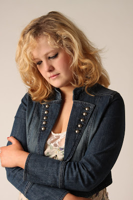
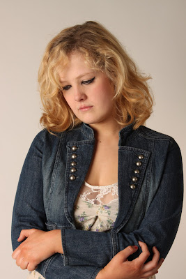
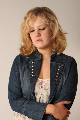
Here are another few examples of the shoots I carried out last Thursday. This particular shoot is intended for the campaign's magazine article. I conducted this shoot at a mid-range distance to capture clear clarity of her facial expressions and give it a somewhat personal feel. I also determined through experimenting with different angles and range shots that this particular range was the most appropriate for the magazine article as that length of shot is a generic shooting distance in many establishes magazine article images.
The first two shots are likely candidates for the campaign as the model is perfectly centred in the middle of the photo and her body language in conjunction with her facial expressions are appropriate in the way that they convey feelings of despair and depression, as well as make her appear alone and helpless. Her body language and the way her arms are tightly folded suggests she's trapped in this despair, and the fact she she's got her head lowered and appears timid and quiet indicates that she feels as though she has no one to turn to, which I felt was an effective feel to give off through the body language as it gives off the impression binge drinking can have devastating consequences on your life that are beyond full emotional repair.
Although the third example I've provided could compete as a candidate for the article imagery, her facial expression looks slightly too vague and gormless in comparison to the other examples provided, as well as the fact that it appears as though her eyes are focusing on a particular object, which I felt detracted slightly from the image as the model's eyes were supposed to look vague and dazed as if they were staring into nothing. Therefore, the likeliest photo I'll use for the magazine article is the first example provided as I feel her body language portrays that of a professional magazine article photo and her eyes and vacant facial expression convey the impression that she feels alone and ashamed with no one to turn to.
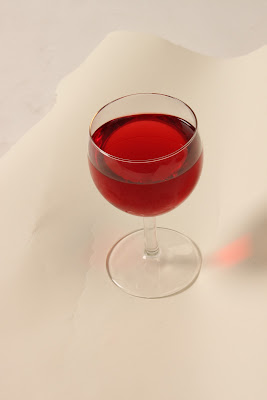
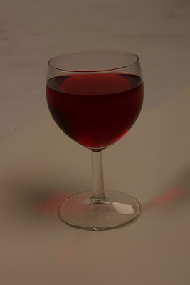
This particular shoot is intended for my T-shirt and badge designs, which serve the purpose of acting as promotional tools for the campaign. Regarding the angle the shots were taken at, I felt that placing the glass on the floor and hovering over it to take the photo would enable the glass to be captured in its entirety and so that you can actually see into the glass. Likewise, I shot the imagery from a distance that enables you to see the entire glass and absorb it as a whole entity as opposed to just capturing the base of the glass.
The first example I've provided is a likely candidate to be used for the actual design as it's bright, which gives it clarity, as opposed to the example below it which was taken before I adjusted the settings on the camera and the lighting equipment therefore is too dark for use. I feel the first example will ultimately look the most effective and clearest when dropped out of its background on Photoshop, therefore it's definitely one of the more likely candidates for the design.
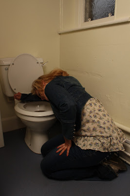
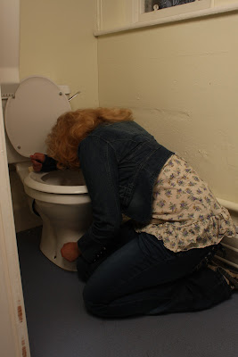
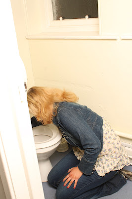
This particular photoshoot was conducted for the magazine cover of my campaign. I conducted this shoot from a long-distance range in order to capture the model in her entirety so that it's clear what's actually happening in the imagery in relation to the message the magazine cover is going to convey once it's created. I determined through experimenting with different angles and range shots that this particular range was the most appropriate for the magazine cover for the mentioned reasons.
Regarding the model's body language, facial expression and her positioning next to the toilet basin employed within the images, they all convey the impression she’s depressed and ashamed of the state she’s in and feels too subdued and ill to hold her head up and look at the camera, which is a suitable convention for the genre of advertising I intended for my campaign to portray (social advertising).
It also creates the impression that we're merely ‘looking in’ on a teenage girl’s everyday life (which mostly likely resembles a vast majority of teenage girls across the country that drink too much on nights out), particularly as her back is turned to the camera and her body language gives off the impression she’s ‘unaware’ she’s being observed.
The first example provided could be a likely candidate to incorporate into the final product as it's not too dark or too bright (although the brightness and contrast may require slight adjustment in Photoshop to give it more clarity) and it portrays the model in her entirety without the obstruction of obstacles around her such as the wall on the left hand side that seems to be an obstruction in various other examples. It also employs a clear view of her facial expression as her head is turned slightly more to the left than it is in other shots, which places emphasis on the overall feel and message the imagery is trying to convey as it's apparent she's pained.
The second example could also be incorporated into the final product as it portrays that same negative feel conveyed through the model's body language and positioning against the toilet basin. It also doesn't consist of any obstructions such as the wall on the left side or the bin beside the toilet and showcases the model in her entirety. However, her facial expression isn't as apparent in this particular image as her facial features aren't showcased, which I feel detracts from the emphasis I intended to place on the imagery with her facial expressions to give it a more real, personalized feel. Therefore, I may not use this particular example for this reason.
Similarly, I feel the third example I've provided isn't appropriate to be incorporated into the final product as it's too bright, which takes the clarity away from the image and detracts from the dark, negative feel it's supposed to have as a product of social advertising. There is also the obstruction of the wall on the left hand side of the photo that hides a section of the imagery, which gives it a tacky, unprofessional feel. Therefore, realistically the first example provided will most likely be the image I incorporate into my magazine cover for the reasons mentioned.

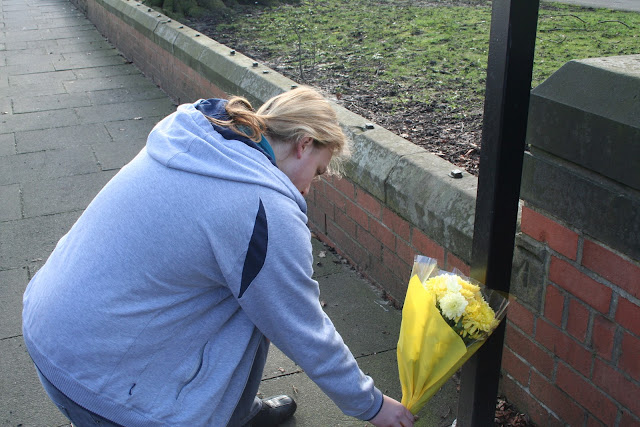

Finally, this particular photoshoot is intended for the viral advertisement (email) element of my campaign. I conducted this shoot from a mid-range shot to ensure that I captured enough of the model and the surrounding location in order to give it clarity and make it clear to the audience where it is, i.e. at Stanhope Park outside college to enable the audience to relate to the location, and what's actually happening within the imagery. I experimented with different angle shots in order to capture as many shots as possible to determine which shots are the most effective to use for the final product.
Regarding the model's body language and positioning, I intended for him to have his back turned towards the camera as opposed to having him upright and facing the camera as I feel this particular positioning conveys feelings of sadness, despair and loss, in conjunction with the fact that the flowers evident in the imagery are not only designed to evoke consideration of the issue of drink driving within the audience, but to evoke empathy from them as well, whether that be sympathy for the driver who's lost his/her life, or shame as the driver was killed as a result of drunk driving.
This particular portrayal of the model and the overall feel of the advert also places emphasis on the melancholy, negative feel of the advert, and the fact he has his back turned towards the camera and gives him a somewhat "hidden" identity and provides him with a neutral feel. It creates the impression we're merely 'looking in' on an average teenager's life, a life that is common amongst many teenagers in the UK, which I intended to convey to the audience that a situation as tragic as that can happen to anyone at anytime in any place (even somewhere familiar like college to an everyday student).
The first example I've provided, although somewhat bright as a result of the sunlight pouring down on the location, could be a possible candidate to use for the email outlet as I feel his body language and positioning in that specific image gives off a professional sort of feel and keeps his identity hidden due to the fact his back is turned towards the camera, again as if we're merely 'looking in' on the situation. I feel the specific angle I've taken the shot at is complimentary of the overall imagery as it consists of a perfect space I can effectively incorporate the slogan into on the left side of the model without it looking tacky or out of place, as well as a good space at the bottom of the image for the statistic information where there won't be the issue of it blending with any dark colours in the imagery itself.
Although the second example I've provided is also fairly ambiguous in that not too much is revealed about the model's face or identity in order to create a more fly-on-the-wall sort of impression, I feel that the specific angle it's taken at doesn't leave much scope for effective positioning of the slogan or text. The only effective space I could incorporate the slogan into is the right side of the model, which would result in the text blending in with the dark colours in the imagery, particularly the black lamppost. Therefore, despite its positive factors and the fact that the imagery is neither too dark nor too bright and even consists of better lighting than the first example in some ways due to the fact it's more neutral and de-saturated lighting, I feel that effective text placement would be an issue if I was to incorporate the image into the final product.
Likewise, the third example I've provided employs the same difficulties due to the fact it was shot at the same angle the second example was. However, another factor that detracts me from considering incorporating it into the final product is the fact that the model's face is slightly more apparent in the image, and although this particular concept doesn't drastically detract from the feel I intended to convey to the audience, his facial expression appears to be somewhat 'blank' and emotionless and as though he's merely 'acting' and isn't conveying any real impression through any factor of his presence that the situation has affected him, unlike the hunched over, ambiguous feel he conveys in various other examples. I also feel that the fact his eyes are widened and apparent in the imagery detracts from the professional feel of the advert.
Therefore, as a result of evaluating the pros and cons of the provided examples, the likeliest image to be incorporated into the final product is the first example, as although it may have been more effective if the sun wasn't shining during the take, I feel the angle it's taken at gives the advert a professional feel and provides it with more scope to experiment with text placement and the positioning of the slogan.


